Product Portfolio & Decision Dashboard
Making priorities, effort, impact and alignment visible.
Summary
Creating visibility across ideas, priorities, effort, impact and strategic alignment — supporting better cycle planning and laying the foundation for historical product-performance comparisons.
Context
Decisions about what to build were being made without a single place to see the whole picture. Effort, impact, priority and strategic alignment lived in different documents and different heads, which made cycle planning harder than it needed to be.
The challenge
Give the organisation one credible, shared view of the product portfolio — good enough to plan cycles against and to compare performance over time.
My role
- Defining what the portfolio view needed to make visible
- Shaping the decision and comparison model behind it
- Supporting better cycle planning with it
- Laying the groundwork for historical product-performance comparison
Approach
One picture of the portfolio
Brought ideas, priorities, effort, impact and strategic alignment into a single, comparable view instead of scattered artefacts.
Design for decisions
Structured the dashboard around the decisions it needed to support — cycle planning and prioritisation — rather than around whatever data was easiest to chart.
Make it comparable over time
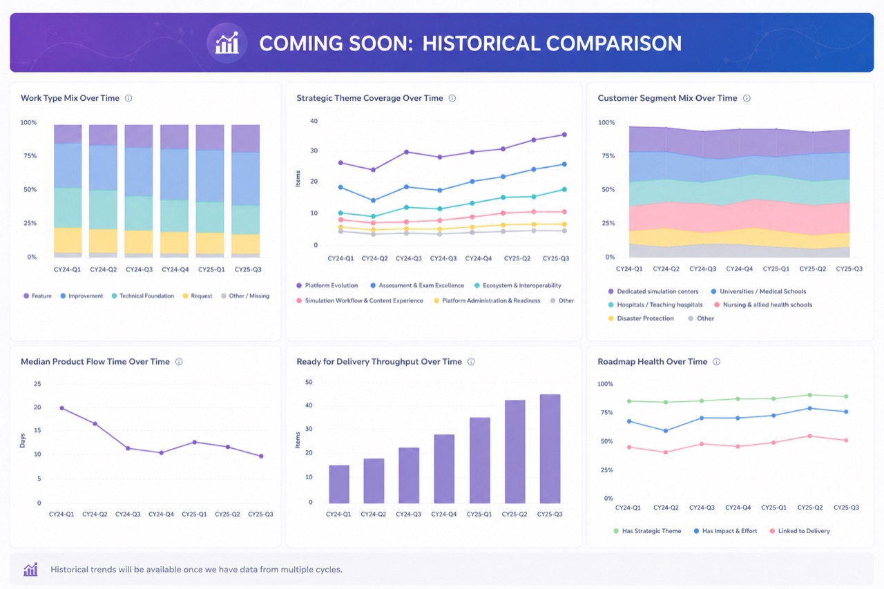
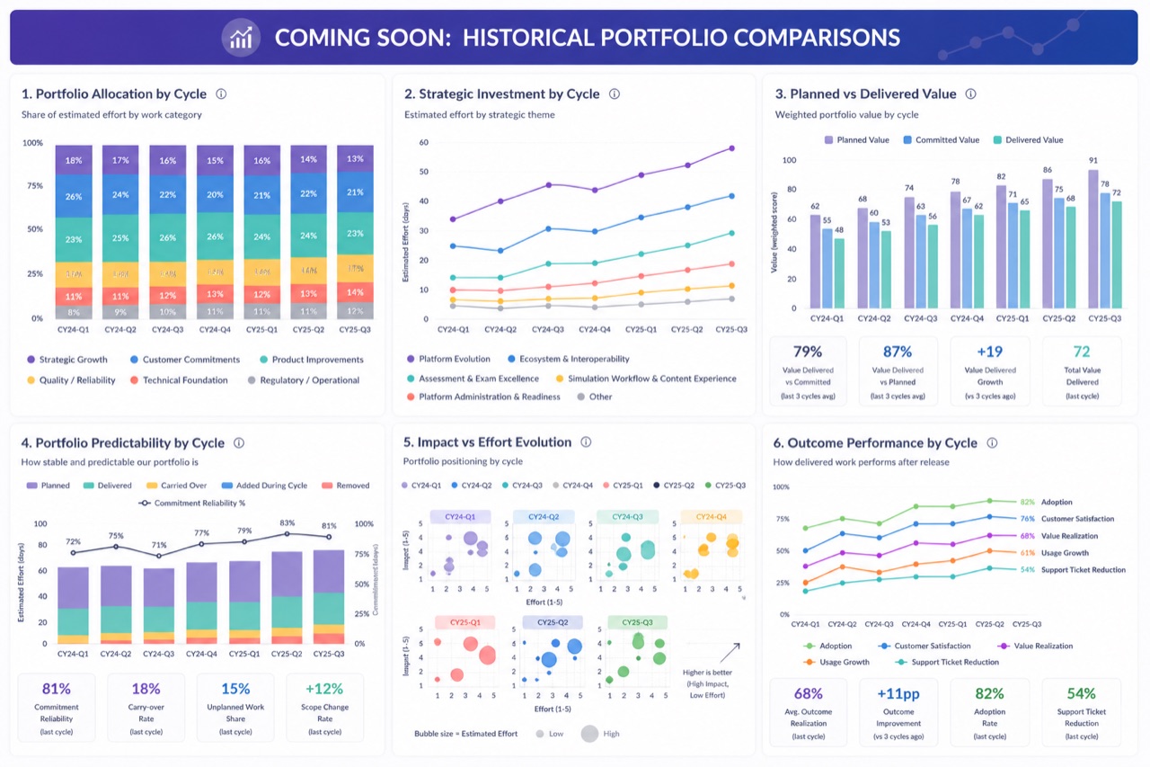
Built the model so that cycles could be compared, creating the foundation for historical product-performance analysis as data accumulated.
Key decisions
Decisions before dashboards
Started from the questions the leadership needed to answer each cycle, and let those define the views — not the other way around.
Honest placeholders
Where multi-cycle history did not yet exist, comparison views were clearly framed as forthcoming rather than filled with invented data.
Artefacts
Outcome
- →A shared portfolio view spanning ideas, priorities, effort, impact and strategic alignment.
- →Better-supported cycle planning, grounded in a single source rather than competing documents.
- →A foundation for comparing product performance across cycles as history builds up.
What I learned
A portfolio view earns its keep by changing conversations, not by looking impressive. The discipline is designing it around the decisions it must support — and being honest about the data you do not yet have.
Next case study — 05
From Engineering to Product Leadership
Want to talk through a problem like this? Get in touch